Showing posts with label Helen K. Beacham. Show all posts

Sunday, August 27, 2017

Depicting Bricks in Ink

Today I was asked, by one of my students, how I incorporate line work (ink) into my paintings that have brick in them.  

"When you do brick outlines in permanent marker do you do rows or start in a corner and fan outward? I think I want to attempt that on this picture."  Then she included her painting, along with one of mine that she wanted to emulate the look and feel of.

Her painting, along with her reference photo.

My painting that shows the bricks she'd like to emulate.
So, here's the input I gave her...I'm hoping it helps others of you as well.

1) First of all, be aware of how large to make your bricks. They will not necessarily b
e the size I used. Depends mostly on how close the building is. 


2) I do draw my brick rows in pencil lightly first to get the angles of the lines as they either move away from me or not (perspective).


3) then, again in pencil, I start to draw in some of the bricks nearest my main focal area (not on the outside edges of the building). Maybe around a door or a window.


4) I either then finish by using pencil or, if I feel confident enough, I jump in with ink. (I use a variety of inking options, but on this one, I used a Sharpie Ultrafinepoint marker.  Since this painting was done en plein air, it was easier to travel with.)


5) For interest, some lines are fatter than others and I never use a ruler in order to keep it fresher.


6) I don't always use ink in my paintings.  But I still try to give the bricks some individual character so that it doesn't look mechanical. Here's an example.

No ink used in this painting.

Please feel free to leave your own watercolors with brick work in the comments section.  We can all learn from each other.

EARLY BIRD REGISTRATION IS NOW OPEN FOR SOME OF MY 2018 WORKSHOPS.
FIND THEM ALL ON MY WEBSITE HERE.


SEE MY LATEST POST HERE.

Friday, February 12, 2016

The mask is gone!!!

The "voice" won out! (You may read yesterday's post HERE)

Here is a pic of where my painting was, as of last evening.


And below is what the painting looks like today, with the masking fluid removed. Dramatically different, no!?  

This is very much STILL  a work-in-progress.
Check back and see what I do next!

It's time to think about Venice in 2017.  Come paint with me! 
Check out my classes HERE.   
Want to be on my mailing list?  Please leave me a Comment...I'd love to hear from you!


Thursday, February 11, 2016

Forming those waves.

Here's where we left off yesterday.


And below is what I just did.  I added darker color (less water) to the ocean between the waves.  I am SOOO dying to take off the masking fluid over the whole thing.  I get to a point where I can't determine what to do next without seeing what it looks like without the mask.  I'll probably ignore that "voice in my head" a tad longer whilst working on the painting some more, but if it won't shut up, I'll happily give in!


And now for a couple of photos of me down by the beach.  Yes, it does get cold here during the winter months.  Not as bad as elsewhere and I'll be eternally grateful to my husband for making this move here with me!!!


It's time to think about Venice in 2017.  Come paint with me! 
Check out my classes HERE.   
Want to be on my mailing list?  Please leave me a Comment...I'd love to hear from you!


Monday, February 10, 2014

"Watching" wins Award

On Saturday, I was awarded a 2nd Place prize for "Watching" which I worked on for what seems like forever.  I encountered stumbling blocks, but I believed in it and just kept on with it.

"Watching" (watercolor, framed size 38" x 34")
(2nd Place in 2D painting: Charleston Artist Guild Member Exhibition)
by Helen K. Beacham Fine Art
Almost all of the painting was completed using "pourings" of various colors (many of which were opaque colors this time around...only the main figure was done in primarily transparent colors to make her stand out).  The judge was Michael Haga, Assistant Dean, School of the Arts, College of Charleston. 

Here, below, is the winner of First Place.  

"Boats" (acrylic) by Brenda Gilliam
1st Place Winner
Approx. Size?  Maybe 11" x 14" (I'm sorry I didn't make a note of it).  Going from memory.

Other pieces that caught my eye as I walked the show are shown below:

Pastel by Elliott West.
I admired the bravery involved in confidently putting those white strokes across the gorgeously completed face!

"Windows to the Soul" (Acrylic Mixed Media) by Catherine Case.
I'm a sucker for lines that stay visible in paintings (and in this case, they actually are an integral part of the overall effect).

"Toogoodoo Rolls" (oil/pastel by Amelia Rose Smith).
The use of those pastel, minty tones in the middle & foreground were very effective...drew me right in.  The card said oil/pastel (if so, VERY  interesting)...not sure if that's what Rose actually used or whether it was a typo on the card...?

Watercolor by Rebecca Taylor.
Becky sought me out at the Awards ceremony.  I had never met her personally, but apparently about 2 years ago when I judged the Mt. Pleasant Artist Guild Show, I gave her 2 awards for 2 of her entries (the names were taped off so I had no idea who got awarded what).  She said she had just moved here to Charleston right before that Show and was thrilled to have her work deemed worthy of showing.  I'd say she has nothing to worry about!

I met one other artist on Saturday (Jackie Kilroe) who just moved to Charleston.  She and her husband (who is Irish) and their son (and cute dog!) lived in Ireland for several years.  We exchanged contact info and I googled her work the next day...wow!  I'm looking forward to getting to know Jackie a bit better as time goes by.  Check out her beautiful watercolors of Ireland here:  http://jackieranney.com/.


Come paint Venice, Montreal, Maine, Charleston, and Magnolia Plantation with me!  Find details HERE.

SEE MY LATEST POST HERE.


Monday, April 1, 2013

Tippette #1 - Bricks & Stones

Tippette = Snippet of a Tip (in watercolor).

Today we begin our journey together.  I promise to post one absolutely free tippette every day, during the month of April.  These will not be discussed in detail, but maybe it'll cause you to think about your art in a new way.  Depending on your own skill level, these will mean more to some of you than to others.  I ask you to stick with me on this journey, and let's see where it leads us.  I look forward to your comments or questions, and I promise to reply to each one.  (Hint:  to figure out where to comment, simply go to the bottom of my daily post and click on the blue words that say "0 comments", or "1 comment" and a box will open up for you to type into.)  Here we go.


Today's topic is bricks and stones.  

The roughness of today's subject usually compels me to use a rough paper (I love Arches 300# but there are many good brands out there).  

I always lightly sketch my bricks and/or stones and I remember to leave room in between them to represent the mortar.  I then paint over the whole wall with a light wash of color (even painting THROUGH the bricks or stones themselves).  Then I add my brick or rock color, sometimes using dry brush, and sometimes wet into wet (e.g. maybe burnt sienna first, then I drop in a touch of green or blue or whatever's desired for the final effect).  Although I don't WANT to paint each brick separately, I make sure each has a unique personality...no cookie-cutter bricks.  After all the brick area is done, I examine the painting to see whether it now needs a unifying wash over parts of the wall (for a cast shadow, for instance...BTW, cast shadows are tomorrow's tippette).  A shadow is then added UNDER the bricks that need it.

Close up detail of "Charleston Alley Gate" by Helen K. Beacham


Detail of "Corner Garden" by Helen K. Beacham
On this one below, I added darker color to the mortar area.  Keep in mind, some mortar is darker than others.  Observe what's in front of you.

Detail of "Simply Rome" by Helen K. Beacham
I hope you found this first tippette enlightening and maybe even exciting!  I think we're off to a great start, but as I mentioned above, I'm anxious for your comments and/or follow up questions!  Happy painting!

Come paint Montreal, Maine, Charleston, and Magnolia Plantation with me in 2014!  In May 2015, we go back to Venice!!!  Find details HERE.


READ MY LATEST POST HERE

Sunday, March 31, 2013

How I Judge Show Winners

I was recently honored to be judging the Mt. Pleasant Artists Guild for their annual show.  I always take such a role very seriously, because I distinctly remember being a "young" artist, submitting my own work for someone else to judge.  

What were they looking for?  How would I compare?  Would I make it?  

I've learned that nothing is certain.  I've learned that a lot depends on the judge, and more depends on me (as the artist) and the stage I'm at with my own art.  I've learned that entering a show is half the challenge (of getting recognized) and sometimes it's more than half.  Just putting yourself out there is the first step.

I saw much that intrigued me at last week's show.  Here's the winner, and then I'll follow up below with my thought process and observations on judging a show.

Oil painting by Faye Sullivan (I'm sorry I don't know the title)  - 1st Place at Mt. Pleasant Artists Guild
Awarded by Helen K. Beacham
Steps I go through when I judge a show:
1.  I ask for artists' names to be covered up before I walk the show, so that everything's anonymous.  Especially because this is a local show and I know many of the artists in this guild.2.  I then walk through it, just inhaling all that's been presented to me.  I walk it a second or third time, and I start to hone in on those that speak the loudest.3.  I study each one of those more closely:  design, composition, color scheme, idea (or subject), and technical skills are taken into consideration.
4.  I don't rule out subjects just because they've been done before.  If it's a marsh scene, is it done in a unique way this time, and does it merit a fresh visit from the viewer?
5.  I try to include a good cross-section of styles and techniques, but I won't do that unless the paintings and/or photography actually merit being included.
6.  The top prize should ideally encompass all of the above criteria.
7.  I then review how many prizes the guild is allowing me to award, and make my final selections.


     My congratulations go to Faye Sullivan for taking 1st Place!  Her glowing wave seemed ready to envelope me in a warm bath, which I was evidently eager for.

Come with Helen K. Beacham and Kelly Medford to paint Venice this October...
click HERE for details!


Saturday, March 30, 2013

"Azalea Impressions"

My newest watercolor on translucent Yupo just got accepted into the 2013 Biennale sponsored by the ART LEAGUE OF HILTON HEAD!  Sweet!


"Azalea Impressions" (watercolor on translucent Yupo) by Helen K. Beacham

Come with Helen K. Beacham and Kelly Medford to paint Venice this October...
click HERE for details!

www.helenKbeacham.com

READ MY LATEST POST HERE

Friday, March 29, 2013

Anonymous Bloggers?

I recently signed up to receive updates to several artists' blogs.  It's fun to read the thoughts of my fellow artists.

The blog "names" are definitely cute and catchy, but the artist's name doesn't appear when I receive my email updates (there's not a signature at the bottom of the blog post either).  I always thoroughly enjoy reading the posts, but I have no way of mentally giving credit to the writer.

So, to my new blogging friends, please know this is meant to be helpful and not mean-spirited.  Do with it as you wish.  Have a great Easter weekend!


Come with Helen and Kelly Medford to paint Venice this October...click HERE for details!

"The Grape Arbor" (watercolor)
by Helen K. Beacham
www.helenKbeacham.com
READ MY LATEST POST HERE!

Thursday, March 28, 2013

Tippettes throughout April!

Every day in April, I'm going to post snippets of tips (tippettes) about how to paint with watercolor.  To receive my blog posts with these tips, you've got to sign up on the right hand side of this page with your email address...Scroll down till you see the box that reads FOLLOW BY EMAIL (then key in your email of course).  That's it!  Easy!  Help me spread the word please!  It's going to be quite a challenge for me to show you something new every day, but I'm up for it!
Helen.

"Sweet Balm" (watercolor with acrylic ink) by Helen K. Beacham


Join Helen and Kelly Medford to paint Venice this October...click HERE for details!

Sunday, March 24, 2013

At the Lake

Sometimes, the simpler, the better.  I like this little guy.  He went to a good home!

"At the Lake" (watercolor 5" x 5") by Helen K. Beacham

Join Helen & Kelly Medford to paint Venice this October...click HERE for details!
www.helenKbeacham.com

READ MY LATEST POST HERE!

Saturday, March 23, 2013

Plein Air Painting

One of my students has offered us access to her family's land for a plein air painting outing, coming up soon!  The area is called FOUR HOLES SWAMP (near Ridgeville, SC) and she took a small group of us out there recently to scout it out.  If you're interested in coming along for my upcoming workshop, message me separately please, so I can send you updates as we finalize our plans:  (helenKbeacham@gmail.com).  p.s. don't worry if you've never painted en plein air before...you have to start somewhere and I can show you how!

I'm told that the spring leaves and flowering trees will be splendid out there in the next few weeks!  Here are some pics from a week ago for you to enjoy in the meantime!


Scouting around for the best plein air spots at Four Holes Swamp.

Join Helen & Kelly Medford to paint Venice this October...click HERE for details!

Focus on Textures in Watercolor

I painted these hounds a while ago, and yes, they really did have those lanky, long legs.  I used watercolors and acrylics for this one.  The dogs were fun to paint and I was consciously trying to paint the three dogs on the left as a "mass" in order to create interest and variety as compared to spreading 6 dogs across the page.  The rusty, iron gate and the weathered wood are what gave me the most fun, because I love to paint textures of all kinds.

"Ready for the Hunt"  (watercolor & acrylic).  Available framed: 35"h x 40"w
by Helen K. Beacham

 Join Helen & Kelly Medford to paint Venice this October...click HERE for details!

Sunday, March 3, 2013

Vandy Massey - U.K. Watercolor Artist

I was recently interviewed by Vandy Massey for her U.K. art blog...Today, I'm returning the favor!  

(You may see Vandy's interview about me by clicking HERE...then scroll down to the February 14 posting on her site).  Sign up to receive her regular posts!

Meet Vandy Massey:  www.VandyMassey.com
   
HKB:  Vandy, where do you live now?  Have you always lived there??
VM:  I live in a village 10 miles outside Cambridge, in the UK. I moved here 17 years ago from Johannesburg, South Africa, where I was born and brought up. I did my school education in a university town in South Africa, so being in Cambridge takes me back to my early years. It's a great place to live because there's always something new and interesting going on.

HKB:  Just curious...is Vandy a nickname?
VM:  Vandy is my full name. It is unusual - I've never come across another person with Vandy as their given name. It's a curse and a blessing. So many people get it wrong because they think it's a mistake when they read it, but once they do get it, very few people ever forget it.

HKB: Have you always painted in watercolor?  Anything else that makes your heart beat fast?
VM: By far the majority of my work has been in watercolor.  The appeal of watercolor is the immediacy of it. There is a spontaneity which is particularly special with watercolors. I also have a fascination with the way the pigments sometimes create their own magic on the paper. It's a bit like having a very beautiful chemistry experiment every time.

I've tried a few pastels and done a couple of oils, but the watercolor has kept me busy so far. I would like to explore working in acrylics and oils more and that is definitely on my agenda for this year.
Watercolor by Vandy Massey - using her favorite blues
HKB: When did you know you wanted to paint?  Were there family influences that caused you to consider art?
VM: I did some art at school but stopped at the age of about 14 when I had to choose between art and math. My sister went to art college after school. She now works as a graphic designer and book illustrator. I have always admired her work and wished I had her talent. (If you could LIKE her page, it would be brilliant - www.loribentleyart.com)  I dabbled in ceramics for a few years (as a hobby) but always thought I had no real artistic talent. Then about three years ago I decided to test that theory and went off for an intensive 4 days of art to see whether there was anything at all there. Since I'm still painting, I guess there was - and lots more to learn.

HKB: What’s your studio like?
VM: I am extraordinarily lucky to have a dedicated space for my painting. We put a summer house in the garden and this is where I can escape to spend time with my brushes and paper. The beauty of that is that I get to walk out and leave a painting part done without having to pack everything away. Just wash the brushes and that's it - it's all ready to pick up again whenever I get to go back into the studio. When I first moved my artwork into the studio, I though I had oceans of space. However, it filled up ever so quickly and I now think I could do with a bigger space.  That said, having a limited space probably keeps me more organized.
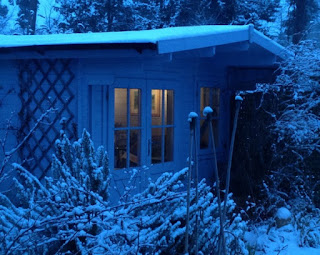
Vandy's cozy studio
HKB:  Which brand of paint do you reach for the most?
VM:  I paint mainly with Winsor and Newton paints. But I do have a shopping list of paints I would like to add to my palette that includes some Daniel Smith and Schminke.

HKB: Favorite colors?
VM: I seem to revert to the blues most of the time - particularly those at the green end of the spectrum. I tend to use strong colors rather than a toned down palette. This isn't a conscious choice - just an instinctive reach for the color that resonates at the moment.  My participation in the One Hundred Wash Challenge   (onehundredwashes.blogspot.com)  was a wonderful way to learn about color and washes.  I would also recommend Maggie Latham's, 31 Days of Color blog posts as a great series of exercises.  (maggielathamstudios.blogspot.co.uk/2012/12/31-days-of-colour.html)

HKB: Favorite paper?
VM: I use a variety of papers - Bockingford, Arches and Hahnemuhle.  At the moment I paint on 140 lb but am planning to work on heavier papers in the future as the hassle of stretching paper or dealing with buckled sheets is a nuisance.
I have traditionally used NOT paper as I really didn't get on with Arches smooth when I tried it. However, I've recently gone back and tried again with the smooth and was quite taken with some of the textures that emerged. That taught me there is value in leaving something for a while and going back to try again when you've had more experience or are in a different frame of mind.

Watercolor by Vandy Massey - showing her subtle and soft reflections
HKB: What size paintings do you prefer creating for the most part?
VM: When I first started painting, I worked on small pieces, up to 20 cm width (equals about 8"). I now rather like a bigger format and work quite often on a 38 x 48 cm sheet (approx. 15" x 20"). I haven't worked any larger than that yet, but I'm sure it will come. I also do small 6"x 7" when I am travelling, when I want to try out a concept or when I just want to do a quick piece.

HKB: Do you get with other painters on any kind of regular basis?  Under what circumstances (formal meetings, plein air, etc?)
VM: I am a member of a few local art societies and try to get to their demonstrations and events. I generally manage one every month or so. That's not really as often as I should do, but I am a bit protective of my painting time and I selfishly want to do my own thing for much of the time. I realize I forfeit the opportunity to learn from others when I do that, but if I ever have more time to paint I will be able to remedy that. Whenever I get a chance, I love to paint with my sister, but as she still lives in South Africa, we only really see each other for a few days each year so it doesn't happen often enough.

HKB:  Do you have a family of your own, and if so, how do they fit into your painting life?
VM: I am very fortunate to have family members who support my painting. My husband is a keen photographer, and elements in his photographs are often the inspiration for a painting. The only challenge we have is that quite often he likes my paintings so much that he'd prefer it if I didn't let them go. We just don't have enough wall space to keep them all. :-)  I also have two sons who are less involved with my painting because they don't live at home any more, but they come to exhibitions from time to time and are happy to give me opinions when I need a different perspective.

HKB:  What about a day job?  How do you juggle it all?  How many hours/week do you get to paint?
VM: I have a fairly demanding day job which doesn't leave me much time to paint. I set up a data management business 12 years ago - I am really a geek. We run management assessments and employee surveys for trainers and HR departments. We've recently started doing investment research as well so I spend 3 days a week in London which cuts down on the amount of time I have to paint.
Generally I manage to fit in a couple of hours every weekend and sometimes get a short evening session.  I do take a paint box and small watercolor pad down to London with me but it's not often that I manage to find the time to use it.

HKB: Do you enter online competitions?  Do you enter European competitions only, or American as well?  What have you learned from entering competitions?
VM: I haven't entered any online competitions yet. I've always found the quality of the entries to be extremely high and haven't really felt ready yet. I have entered paintings for offline juried exhibitions in the UK from time to time and had many rejections and few acceptances. From that I have learned that you need to have a thick skin and to use the experience of rejection to spur you on to do better, rather than letting it demotivate you.

HKB:  Do you have an inspiration that you can visit whenever you want to?  (a museum, a city garden, etc)?
VM: My London time affords me lots of opportunities to visit galleries in my lunch time and after work. I am particularly fortunate to be based about 20 minutes' walk away from The Mall Galleries which houses the exhibitions for the Federation of British Artists' societies. I also walk to as many of my meetings as I can manage, as that often gives me the opportunity to look in gallery windows when walking past. If something grabs my attention I'll pause or go in to take a better look.

Closer to home, I gain inspiration from my garden. My studio has a glass door and windows which face a courtyard garden packed with color every summer. It's a lovely place to sit and paint with the doors open.

HKB: Do you have other loves in your life like dancing, sports, music?  How do they contribute to your artistic life?
VM: I wish I could dance but I'm not well enough coordinated. I do enjoy going for walks, exploring new cities (which makes it fabulous to have Europe on the doorstep), and cooking with my family. Whenever we're all cooking, there's always music in the kitchen. We all enjoy good rhythm so African or Latin music always ticks the right boxes. I always have music playing in the studio and will often select the music to suit the mood of whatever I am painting. Sometimes it works the other way round. If I'm about to start a painting, the music can influence what I paint and the style of the work. Recently I've been painting to the sounds of upbeat, funky music. I suspect it shows.

HKB: When you think about your favorite artist(s), what do you think you like about them?
VM: I love paintings that draw the viewer in. They may do that with an atmosphere, a loose painting style, or a sense of mystery that makes you want to see more.  My favorite artists (and it is a growing list) have the ability to do that with their brushes. They have a lightness of touch that shows mastery of the medium. I am in awe of that level of ability.

HKB: What would you still like to learn about watercolor?  What do you think you’ve mastered so far?
VM: Composition and consistency are the two words that come to mind when I think of what I would still like to learn. I have increasingly come to see that strong composition is possibly the most important aspect of a painting. I have spent most of the last couple of years concentrating on technique, and I think I need to shift my focus onto composition a bit more. Much of the time, I paint instinctively. I am aware that sometimes a bit more planning would be beneficial. In terms of consistency, I think it's that magic 10,000 hours of practice they talk about to make a master. To be consistently good at something, you need to put in the hours. Given the relative limits of my painting time, it may take some years to get the amount of practice that will increase the consistency of my painting competence.  But then again, perhaps that's what it means to be an artist: there is always some new challenge and the drive to paint better. And that's all part of the fun of it.

What have I learned? (I'm not sure I could say, mastered yet)  My first method of discovering whether I could paint, was to spend four days with an art teacher trying every medium I could manage in the time. So I did pencil drawing, chalk pastel, oil pastel, watercolor and acrylic works in that time. And I have to confess, my watercolor sucked! It really did suck. It was by far the clumsiest and least competent piece of work I did in those four days. So naturally, being me, I chose to focus on the medium I found the hardest to deal with. I never make things easy for myself :-) But I am pleased that I did, because I very quickly came to love watercolor.

I still have that first painting, and I look back at it from time to time to remind myself of how much I've learned. I think the most valuable thing I've learned about watercolor is control by letting go.

HKB:  What's on your calendar now?
VM: I'm about to do my first joint show with two other artists. The show will be held March 9-10 in a local gallery. I'm honored to be exhibiting alongside Mark Judson and Denise Shearing. More information about the exhibition can be found at:  http://www.vandymassey.com/2013/02/exhibition-time/

HKB:  How can people fine you on social media?  And thanks for sharing with us today!
VM:  I can be found at:
My blogs at www.VandyMassey.com


                                   Come with Helen to paint Venice this October...click HERE for details!

Monday, February 11, 2013

Watercolor Palettes for Large Paintings

I'm in love with painting larger paintings.  When I do, I use bigger brushes and find that the wells on my regular palette are small and get in the way of being spontaneous and creative.  As a result, I've come up with several homemade palettes that work best for me.  

The one on the left is your basic muffin tin (plastic...the microwavable kind...found at Goodwill).  It's already a pale color, so it works.  The middle one is a box top that I've cut openings into.  Into the openings I drop plastic wine tumblers and I squeeze my paint into them.  As I need different colors for different paintings, I pull them out and replace as needed.  I never throw the cups away because watercolor is resoluble.  The tool on the right was given to me by my friend, Sonia, who bought it at either Lowe's or Home Depot.  It was black, so I spray painted it white (you want to see your true paint colors, so white is best).  Lowe's is one of my favorite spots to shop for the unconventional art tool...I have no idea what this was intended for, but it works for me!  Balanced on the box top is my 2" brush so that you can see size relationships.  I combine these tools with either styrofoam plates or my regular watercolor palette lid for the mixing of my colors.


Come with me to paint Venice this October...click HERE for details!

READ MY LATEST POST!

Saturday, February 9, 2013

Tulips

On Fridays, I mentor Anne P., who has studied with me on and off for a couple of years.  We usually meet in my studio where we either paint or talk about art-related matters.  Yesterday she walked in with an armful of tulips and a crystal vase!  We quickly set up an impromptu still life composition and proceeded to photograph it from various directions.  Then we added a lamp for additional drama and cast shadows (and highlights) and then we FINALLY got down to the business of sketching our still life! 

Our still life setup with my initial wash in the foreground.
Close up of the tulip photo
This was my initial attempt (I had incorporated pen & ink).  I thought I captured the delicateness of the flowers, but I thought it looked a bit weak. Below is the final piece, which I feel is a much stronger painting.  Which do you prefer??  Should I have left it alone????
"Tulips"  (watercolor)by Helen K. Beacham
Unframed (11x9): $395 or Framed (23x21) $495 total

And here's Anne's version (not finished when she left my studio), painted from a totally different angle!
I love the horizontal composition!  Very intimate!
Tips when painting floral still lifes:

1.  Play with the composition and move around your still life till you "feel" it (decide from which angle you want to paint it).  Add a simple light to cast some interesting shadows.

2.  If you have trouble with drawing still lifes, think of what's in front of you as a 2-D image (like a photo).  Picture the edges of the photo (to correspond to your paper size) and draw in the major points of the still life before you fill in the details.

3.  Add flowers (and/or leaves) to your drawing where you need them for balance, even if they're not there.

4.  If you wish, add masking fluid to save a few sparkles of white.

5.  After your overall first wash, start painting in the focal area.  The rest MIGHT not need much more.  If you start somewhere else, you might be committing yourself to a more detailed piece than intended on the front end.

By the end of the afternoon, our tulips had opened so deliciously that we had to spend another few minutes photographing them for a future painting!  Thank you, Anne, for Friday's challenge!


Come with me to paint Venice this October...click HERE for details!

READ MY LATEST POST!